
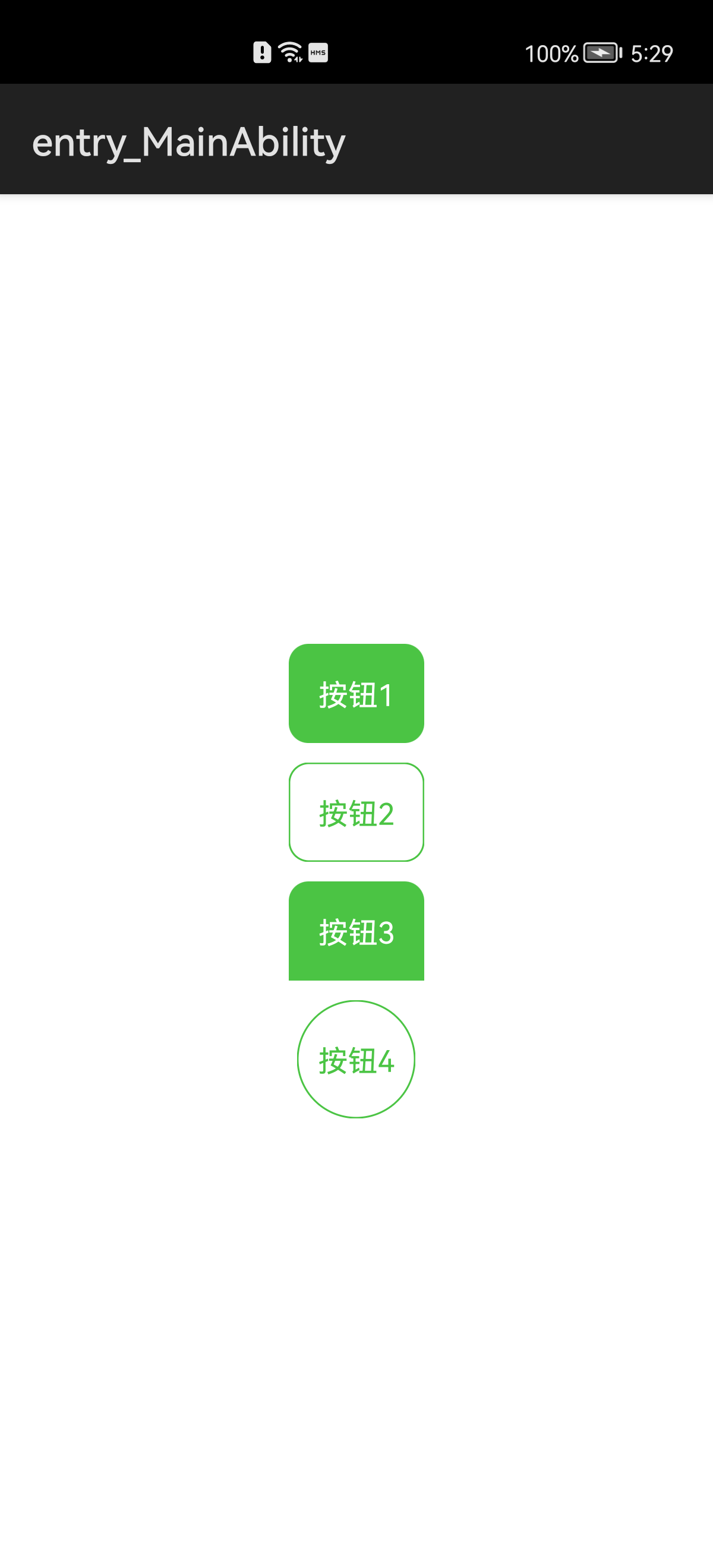
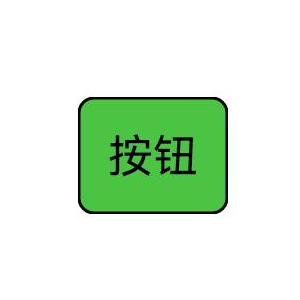
鸿蒙Java UI 按钮默认是没有样式,一般我们是采用创建shape类型的xml设置,但是实际项目中,有些只是背景色一样,圆角大小不一样,也要创建对应的xml,如果按钮样式多的话,需要创建很多xml,比较繁琐。为了方便采用自定义组件方式实现。只需更改参数就能实现不同的样式,如下图:
因为自定义组件的实现原理就是参考shape.xml,只不过使用java代码实现,所以先看下xml设置样式
1、使用xml设置样式:
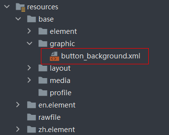
1.在resources\base\graphic目录下,创建shape类型button_background.xml
<?xml version="1.0" encoding="UTF-8" ?>
<shape
    xmlns:ohos="http://schemas.huawei.com/res/ohos"
    ohos:shape="rectangle">
    <!--圆角-->
    <corners ohos:radius="5vp"/>
    <!--背景色-->
    <solid ohos:color="#4BC444"/>
    <!--边框-->
    <stroke
        ohos:width="1vp"
        ohos:color="#000000"/>
</shape>
2.在布局中设置按钮背景
<?xml version="1.0" encoding="utf-8"?>
<DirectionalLayout
    xmlns:ohos="http://schemas.huawei.com/res/ohos"
    ohos:height="match_parent"
    ohos:width="match_parent"
    ohos:alignment="center"
    ohos:orientation="vertical">
    <Button
        ohos:height="match_content"
        ohos:width="match_content"
        ohos:background_element="$graphic:button_background"
        ohos:padding="10vp"
        ohos:text="按钮"
        ohos:text_size="15fp"/>
</DirectionalLayout>
3.设置点击效果,创建state-container类型xml,在创建两个shape类型文件,一个默认效果、一个点击效果
<?xml version="1.0" encoding="utf-8"?>
<state-container
    xmlns:ohos="http://schemas.huawei.com/res/ohos">
    <!--点击效果-->
    <item ohos:state="component_state_pressed"
          ohos:element="$graphic:shape_button_pressed"/>
    <!--默认效果-->
    <item ohos:state="component_state_empty"
          ohos:element="$graphic:shape_button_normal"/>
</state-container>
2、使用自定义组件设置样式:
1.主要是两个类:ShapeElement 设置样式 和 StateElement 设置状态效果
ShapeElement 对应 shape.xml,主要方法说明:
- setShape(int shape) //设置形状
- setCornerRadius(float radius) //设置背景颜色
- setCornerRadiiArray(float[] radii) //设置单独每个角的圆角半径
- setRgbColor(RgbColor color) //设置背景颜色
- setStroke(int width, RgbColor color) //设置边框宽度和颜色
StateElement 对应 state-container.xml,主要方法说明:
- addState(int[] stateSet, Element element) //设置状态数组和一个ShapeElement对象
stateSet 状态值设置:
- 默认状态:为负数 -ComponentState.COMPONENT_STATE_PRESSED (默认状态按理说应该是 ComponentState.COMPONENT_STATE_EMPTY, 但设置了不起作用)
- 点击状态:为正数 ComponentState.COMPONENT_STATE_PRESSED
2.继承系统Button,注释很详细,看代码
import ohos.agp.colors.RgbColor;
import ohos.agp.components.*;
import ohos.agp.components.element.ShapeElement;
import ohos.agp.components.element.StateElement;
import ohos.agp.utils.Color;
import ohos.app.Context;
/**
 * 圆角、边框、点击效果
 */
public class CustomButton extends Button {
    private final Context mContext;
    //圆角半径
    private float cornerRadius = 0f;
    //圆角半径-左上
    private float cornerRadiusLeftTop = 0f;
    //圆角半径-左下
    private float cornerRadiusLeftBottom = 0f;
    //圆角半径-右上
    private float cornerRadiusRightTop = 0f;
    //圆角半径-右下
    private float cornerRadiusRightBottom = 0f;
    //默认背景色
    private Color bgDefaultColor = Color.TRANSPARENT;
    //按压背景色
    private Color bgPressedColor = Color.TRANSPARENT;
    //边框线宽度
    private int strokeWidth = 0;
    //边框线颜色
    private Color strokeColor = Color.TRANSPARENT;
    public CustomButton(Context context) {
        this(context, null);
    }
    public CustomButton(Context context, AttrSet attrSet) {
        this(context, attrSet, null);
    }
    public CustomButton(Context context, AttrSet attrSet, String styleName) {
        super(context, attrSet, styleName);
        mContext = context;
        if (attrSet.getAttr("cornerRadius").isPresent()) {
            cornerRadius = attrSet.getAttr("cornerRadius").get().getFloatValue();
        }
        if (attrSet.getAttr("cornerRadiusLeftTop").isPresent()) {
            cornerRadiusLeftTop = attrSet.getAttr("cornerRadiusLeftTop").get().getFloatValue();
        }
        if (attrSet.getAttr("cornerRadiusLeftBottom").isPresent()) {
            cornerRadiusLeftBottom = attrSet.getAttr("cornerRadiusLeftBottom").get().getFloatValue();
        }
        if (attrSet.getAttr("cornerRadiusRightTop").isPresent()) {
            cornerRadiusRightTop = attrSet.getAttr("cornerRadiusRightTop").get().getFloatValue();
        }
        if (attrSet.getAttr("cornerRadiusRightBottom").isPresent()) {
            cornerRadiusRightBottom = attrSet.getAttr("cornerRadiusRightBottom").get().getFloatValue();
        }
        if (attrSet.getAttr("bgDefaultColor").isPresent()) {
            bgDefaultColor = attrSet.getAttr("bgDefaultColor").get().getColorValue();
        }
        if (attrSet.getAttr("bgPressedColor").isPresent()) {
            bgPressedColor = attrSet.getAttr("bgPressedColor").get().getColorValue();
        }
        if (attrSet.getAttr("strokeWidth").isPresent()) {
            strokeWidth = attrSet.getAttr("strokeWidth").get().getIntegerValue();
        }
        if (attrSet.getAttr("strokeColor").isPresent()) {
            strokeColor = attrSet.getAttr("strokeColor").get().getColorValue();
        }
        init();
    }
    private void init() {
        //包含多个状态的Element
        StateElement stateElement = new StateElement();
        //默认的Element
        if (bgDefaultColor.getValue() != Color.TRANSPARENT.getValue() || strokeWidth != 0f) {
            ShapeElement seDefault = getShapeElement();
            seDefault.setRgbColor(RgbColor.fromArgbInt(bgDefaultColor.getValue()));
            stateElement.addState(new int[]{-ComponentState.COMPONENT_STATE_PRESSED}, seDefault);
        }
        //按压状态的Element
        if (bgPressedColor.getValue() != Color.TRANSPARENT.getValue() || strokeWidth != 0f) {
            ShapeElement sePressed = getShapeElement();
            sePressed.setRgbColor(RgbColor.fromArgbInt(bgPressedColor.getValue()));
            stateElement.addState(new int[]{ComponentState.COMPONENT_STATE_PRESSED}, sePressed);
        }
        //设置到背景中
        setBackground(stateElement);
    }
    /**
     * 获取公共的Element,一般不同状态下圆角都一样。
     */
    private ShapeElement getShapeElement() {
        ShapeElement shapeElement = new ShapeElement();
        // 设置形状
        shapeElement.setShape(ShapeElement.RECTANGLE);
        if (cornerRadius != 0f) {
            // 设置四角半径
            shapeElement.setCornerRadius(vp2px(cornerRadius));
        } else {
            // 单独设置四角的圆角半径
            // 左上角需要xy轴 left_top_x,left_top_y,其他类似
            shapeElement.setCornerRadiiArray(new float[]{
                    vp2px(cornerRadiusLeftTop), vp2px(cornerRadiusLeftTop),
                    vp2px(cornerRadiusRightTop), vp2px(cornerRadiusRightTop),
                    vp2px(cornerRadiusRightBottom), vp2px(cornerRadiusRightBottom),
                    vp2px(cornerRadiusLeftBottom), vp2px(cornerRadiusLeftBottom),
            });
        }
        if (strokeWidth != 0f) {
            // 设置边框宽度和颜色
            shapeElement.setStroke((int) vp2px(strokeWidth), RgbColor.fromArgbInt(strokeColor.getValue()));
        }
        return shapeElement;
    }
    private float vp2px(float value) {
        return AttrHelper.vp2px(value, mContext);
    }
}
3.在布局中使用
<?xml version="1.0" encoding="utf-8"?>
<DirectionalLayout
    xmlns:ohos="http://schemas.huawei.com/res/ohos"
    ohos:height="match_parent"
    ohos:width="match_parent"
    ohos:alignment="center"
    ohos:orientation="vertical">
    <com.ldd.myapplication.CustomButton
        ohos:height="match_content"
        ohos:width="match_content"
        ohos:padding="15vp"
        ohos:text="按钮1"
        ohos:text_color="white"
        ohos:text_size="15fp"
        ohos:bgDefaultColor="#4BC444"
        ohos:bgPressedColor="#FF379132"
        ohos:cornerRadius="10"/>
    <com.ldd.myapplication.CustomButton
        ohos:top_margin="10vp"
        ohos:height="match_content"
        ohos:width="match_content"
        ohos:padding="15vp"
        ohos:text="按钮2"
        ohos:text_color="#4BC444"
        ohos:text_size="15fp"
        ohos:cornerRadius="10"
        ohos:strokeWidth="1"
        ohos:strokeColor="#4BC444"/>
    <com.ldd.myapplication.CustomButton
        ohos:top_margin="10vp"
        ohos:height="match_content"
        ohos:width="match_content"
        ohos:padding="15vp"
        ohos:text="按钮3"
        ohos:text_color="white"
        ohos:text_size="15fp"
        ohos:bgDefaultColor="#4BC444"
        ohos:bgPressedColor="#FF379132"
        ohos:cornerRadiusLeftTop="10"
        ohos:cornerRadiusRightTop="10"/>
    <com.ldd.myapplication.CustomButton
        ohos:top_margin="10vp"
        ohos:height="60vp"
        ohos:width="60vp"
        ohos:text="按钮4"
        ohos:text_color="#4BC444"
        ohos:text_size="15fp"
        ohos:cornerRadius="30"
        ohos:strokeWidth="1"
        ohos:strokeColor="#4BC444"/>
</DirectionalLayout>
圆角、边框、点击效果都是常用的样式,后面可根据提供的api自行扩展对应的样式,如:渐变色、边框为分割线类型、选中的样式等等。